












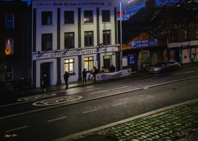


Impermanence
When I started on the Impermanence chapbook, I was looking at statuary. I saw them as lifespans reduced to instants frozen by, in and for time. From the perspective of a geologist, educated to read the narratives in libraries of rock, I hoped to portray stories in ephemeral moments; brevity in the context of universal age. I came to see ‘street furniture’ as metaphors for space and time. I didn’t need to travel more than 15 km from home to see subjects often lit by the light of a sun, some 95 million kilometres above me, or indeed sometimes lit by electric lights, driven by gas extracted from rocks more than 95 million years old. Light from space and time.
If you take a photograph with an exposure that might last 1/120th of a second, are you giving the subject 15 minutes of fame? It might take 600 seconds to develop and print. If any viewer dwells 3 seconds but 100 people see the photo, one could argue that the picture has had an exposure time of nine hundred seconds. That is fifteen minutes. Fame or not.
On Text
A subscriber asked me to consider text legibility; last year’s red on black wasn’t ideal. I found myself in a new world of challenges. I had thought colour shifts from camera to screen to chapbooks were a waking nightmare. Text contrast issues are similarly obtuse.
I did some experiments with contrast (yes, there are websites like contrastchecker for such things). I learned that the contrast for my red on black schema was well below recommended limits for print legibility at 30 cm reading distance. It had been 1.75 for all of 2021.
Coincidentally, I’d been reading about colour and had just finished the chapter on yellow. Experimentation led me to a gold/yellow that has a contrast of 7.02 on black.
The new look text is yellow(ish), often called Sunflower Island. We’ll call it Nunn Yellow #FFCD03 and it’s said to have a wavelength of about 578.26 nm. Or does it?
Further reading: James Fox ‘The World According to Colour’. And Leatrice Eiseman who published ‘The Complete Color Harmony’ while Executive Director at the Pantone Color Institute.
